
The functionality of Web Components within a form must be handled carefully, particularly when they are components encapsulated in a Shadow DOM using shadowRoot. There is an excellent review of the issues that arise, especially those related to accessibility, in the note Web Components Accessibility FAQ. We want to make it clear that the components generated by WCF take all these difficulties into account and produce 100% accessible Web Components.
ShadowRoot and forms
The key idea of the ShadowRoot is to encapsule the Web Component by isolating it from its surroundings, generating an environment within the document completely independent from the outside. This encapsulated space is called Shadow DOM, and as opposed, the traditional space of the document is called Light DOM (or often plain DOM).
When the component encapsulates a presentation and features that do not depend on the rest of the document, or when their relation to other elements and components is established through JavaScript, this encapsulation shields the component from external influences, and allows it to present and behave uniformly in any situation.
But when the component encapsulates HTML elements that depend on other preceding or descendant elements to display or behave, the interruption in the flow produced by ShadowRoot creates anomalous situations. This is the case, for instance, of a tr tag that the ShadowRoot separates from its corresponding table tag, and naturally, the case of input tags separated from the form tag.
To solve this problem, Web Component Factory implements two key features: how it generates the ShadowRoot and the ElementInternals interface of the DOM.
Single ShadowRoot for the component and its subcomponents
Each comopnent is capable of detecting if its displayed (rendered) within the DOM shadow of a component which already has a ShadowRoot, or if it displays directly within the DOM light of the docuemnt.
In the first case, the component will generate wihout ShadowRoot, as opposed to the second case, in which it will generate with ShadowRoot.
This behavior is automatic, valid for all components generated with WCF, and does not require any additional action.
The generated ShadowRoot is open, so its content is accessible from JavaScript. The WCF API makes the presence or absence of ShadowRoot transparent to programming.
Intensive use of the ElementInternals interface
The ElementInternals interface takes part of the standard interfaces of the Document Object Model, and its specific function is to provide Web Components developers with a tool to fully and smoothly integrate with web forms.
Web Component Factory uses this interface to equip fields and etiquettes with all the functionality and integration into the forms that hosts them, in a way that the tag functionality for inputs such as input, label or select is identical to the same tag within a Light DOM form.
Fields generated from HTML
The creation of components that include fields for forms from HTML is straightforward and simple. If the HTML is well-formed and the appropriate attributes are added, the corresponding fields will be generated, including the unrestricted use of variants and switches, as shown in the example below.
The following is the HTML code (we assume there is a stylesheet that gives content to each of the classes). The meaning of the attributes included in the code is detailed on the corresponding support page.
<div class="Form-group" data-component-id="campo-texto" data-is-variant-default="true" data-string-attr="estado-comun">
	<div class="Form-label-wrap">
		<label class="Form-label" for="example-campo-comun">Etiqueta de campo común:</label>
	</div>
	<div class="Form-object-wrap">
		<input class="Form-widget" name="example-campo-comun" type="text" id="example-campo-comun" aria-describedby="ayuda-example-campo-comun" data-css-switch="largocampo-auto-medio-corto"/>
		<div class="Form-hint" id="ayuda-example-campo-comun" data-css-switch="ayuda">Texto de aclaración</div>
	</div>
</div>
 <div class="Form-group" data-component-id="campo-texto-1" data-string-attr="estado-ayuda">
	<div class="Form-label-wrap">
		<label class="Form-label" for="con_tooltip-2">Con modal de ayuda:</label>
	</div>
	<div class="Form-object-wrap">
		<input type="url" class="Form-widget" id="con_tooltip-2" name="con_tooltip-2" aria-describedby="consulta-campo-con-link" />
		<div class="Form-hint" id="ayuda-example-campo-comun" data-css-switch="ayuda">Texto de aclaración</div>
		<div class="Form-status Form-status--question" id="consulta-campo-con-link"><a href="" data-toggle="modal" data-target="#modalExample">Link al modal</a></div>
	</div>
</div>
<div class="Form-group" data-component-id="campo-texto-2" data-string-attr="estado-validado">
	<div class="Form-label-wrap">
		<label class="Form-label" for="con_tooltip-1">Con ícono:</label>
	</div>
	<div class="Form-object-wrap">
		<input type="url" class="Form-widget" id="con_tooltip-1" name="con_tooltip-1" aria-describedby="campo-ok" value="1.121.122-4"/>
		<div class="Form-hint" id="ayuda-example-campo-comun" data-css-switch="ayuda">Texto de aclaración</div>
		<div class="Form-status Form-status--ok" id="campo-ok">Dato validado</div>
	</div>
</div>
And the following is the generated field, with the corresponding variants and switches.
The variant and switch combos are added to the example and are not part of the component.
Forms generated from Figma
Just like from HTML, components that include fields for forms can be generated from Figma.
To create a field within a component, the tag of the corresponding field is added as a prefix to the name, then a hyphen (without spaces), and followed by the element name. In the case of an input, the prefix can also include the type attribute of the field, separated by a hyphen from the term input.
For example, if the frame named campo1 is renamed to input-text-campo1, WCF will generate an input for the frame instead of a div and add the type=text attribute within the tag.
All styles added to the frame will be included in the CSS of the generated field. It is very important to note that a form field does not accept the same properties as any HTML element, and has additional features and behaviors that must be taken into account. For example, if text is included within the frame mentioned above, an input tag containing a p tag will be generated. This makes no sense in HTML, and the browser will simply ignore the p tag and the text it contains.
Let’s take as an example the following Figma block:
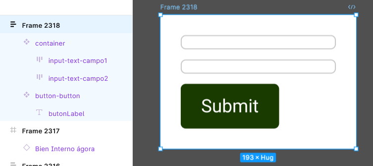
It will create the following form components, noting that a component can contain more than one field. In the example, it has 2 inputs, but it can have an unlimited number, mixing field types as needed.
A final consideration to keep in mind is that CSS is more powerful and expressive than Figma. Attributes like width-max or padding do not have a counterpart between Figma tools. An alternative is to try to generate equivalent behaviors in Figma, such as attempting to emulate max-width by enclosing a hug field >< within a fit box├─┤, so that the content extends up to a determined limit. Our recommendation is to always keep the component as simple as possible, both on the Figma and WCF sides, and adjust these details with a few lines of custom CSS.
In the example above, this criterion was followed by adding a CSS attribute max-width:300; for each input.
Select, checkbox and radiobutton
Fields like select, checkbox and radiobutton have the peculiarity of being made of multiple fields, and therefore require special treatment.
In every case, it is necessary to create a mother component, which wraps up options, and add the options as items inside. In the tag select case, it being the tag format standard, with option tags within. OR In the tag select case, it follows the standard tag format, with option tags nested within. In the case of checkboxes and rabiobuttons, it is necessary to create a specific subcomponent for the item.
Given that each problem has its singularity, specific content about them deserves to be addressed.
Leave a Reply